
HipCooks

The Goal
Conduct user research to identify pain points that deter users from successfully booking a cooking class.
Create a new website flow and design that will allow users to easily choose and book a HipCooks class.
Timeline & Platform
3 Week Sprint
Responsive Web
Overview
The Challenge
Team
HipCooks offers various cooking classes across the west coast. Each class focuses on a specific cuisine through experimental / non – traditional methods of cooking by eliminating measuring. Users can then dine in and enjoy their meal with a glass of complimentary beverage.
When customers visit the website, they find it challenging to discover the right class for them. There is no efficient way to search and buy a cooking class. How might we help users feel confident about choosing the right class, and streamline the entire process?
UX Designers
My Role
UX Designer
Research
Original Site
Heuristics Analysis
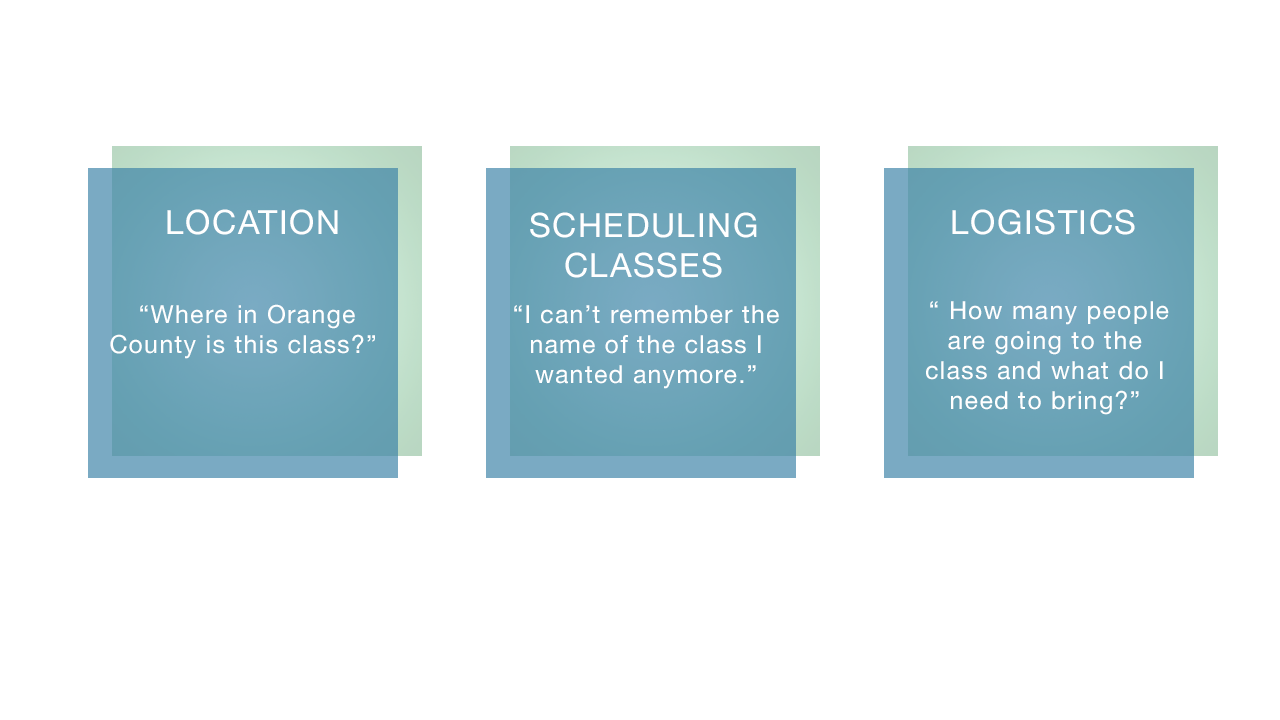
Using a heuristic chart, I found three most severe main pain points through the LEMERS Method:
• Location: Users could not identify the closest location because the descriptions were not clear.
• Call To Action: Next steps in the search/booking process were not clear.
• Scheduling: The class scheduling page is overwhelming, and users could not find a class they liked that would also work into their schedules.
• Without clear directions to move forward, users were stuck on the description page.


“This scheduling site is really bumming me out. There’s too much text and I don’t want to sift through the information.”
C&C Analysis
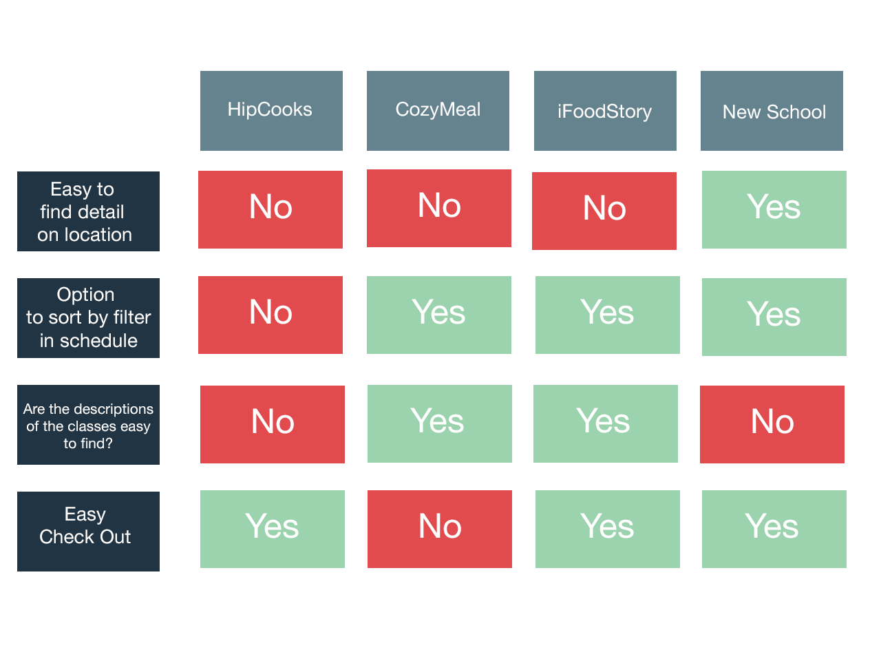
I ran a competitive and comparative analysis using three rival companies: CozyMeal, iFoodStory, and New School.
Hipcooks excelled in the easy check out section, but lacked in the location details, option to sort by filter in the scheduling page and descriptions of the classes.
User Demographic Survey
Most of our users were on the younger end with ages varying from early 20s to 30s.
Their motivations behind booking a cooking class was to have a fun experience with others.
Interviews
I interviewed 4 users to gain perspective on their pain points on their journey. Their pain points matched what I had found in my heuristics analysis and led me to another insight.
• Could not decipher where the locations were based on Hipcooks’ labels
• All 4 users mentioned the scheduling aspect was stressful and made them want to give up and find a different company. The amount of text and lack of sorting left users disgruntled.
• Class logistics were confusing to users. They could not decipher the number of people per class and the materials needed for each cuisine.
Synthesis

Persona
Busy Briana was created to embody the users I had interviewed.
• Busy Briana is a 28 year old millennial working in business, living in Mid-City, Los Angeles
• Spends over 5 days a week working and relaxes by taking time to do fun experiences with her friends
• Motivation: Enjoy a nearby fun cooking experience with her friends that can fit into her busy schedule
User Flow
Contrary to the confusing and ambiguous location details at the beginning of the process, the proposed user flow will have the option to choose the location based on neighborhood or to search by zipcode.
Problem Statement
When busy active millennials are using the website, they are finding it challenging to discover which classes work for them. How might we streamline and help them stay informed on which classes fit their busy schedules?


Feature Prioritization
After analyzing some of the main pain points users were going through, I decided to implement the top two must features from the MSCoW location specificity to help users in the beginning find the exact location where they need to go and the option to sort and look through a calendar was needed.

Pain Points
• The locations are vague. She is unsure what constitutes West LA and East LA.
• The cluttered suddenly page is frustratingly difficult to navigate which wastes her time clicking back and forth and leaves her annoyed.
• When she finally find a class she likes, she is disappointed to find that it has been waitlisted despite the button still leading her to Sign Up.


Open Card Sort
I conducted an open card sort with 4 users to determine what the users preferred to see on the website first.
Insight
All 4 users struggled to sort the classes based on category or by day. They shared that they would prefer to have both options.
Design


Paper Prototype
I tested with 5 different users to get insight on the two different ways to organize location as well as on the new class scheduling system.
MIDFI Prototype
Taking the insights from the paper prototype, I designed and tested a digital Mid Fi prototype to get a better insight on the interactions users would have.

Closed Card Sort
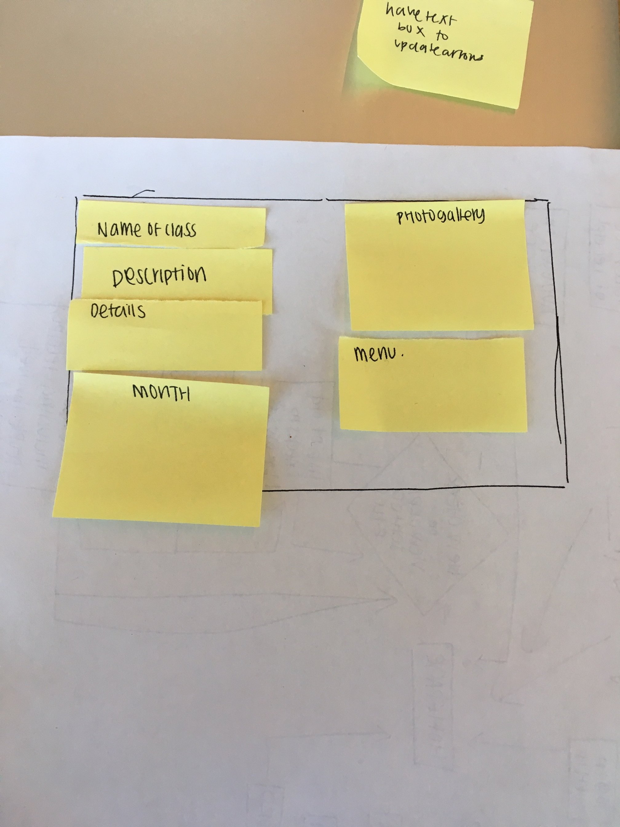
This prompted me to conduct another card sort to categorize what information was important to users when it came to the description card.
Both users eliminated the second calendar that displayed next available dates for each course. Instead, I listed class availability on the previous page; users agreed that this simplified the process and page hierarchy

Moodboard
One user stated, “The branding colors of the current website is a little chaotic for me.”
Users felt that the current website’s bright-saturated colors made the company seem less legitimate. With that, I took the original colors and turned down the saturation to invoke themes of maturity, trustworthiness, and sophistication.

Original Logo
Proposed Logo

Final Mockup
HIFI Prototype
The high fidelity prototype was met with positive responses and had a few minor suggestions regarding the description card, which led me to make dietary restrictions more prominent.
Insights
• Users generally liked the map feature more than the boxes featuring the cities, but two users advocated for the streamlined method of the cities since “they knew where neighborhoods were in Los Angeles”
• The duo feature of the calendar and browse by classes was effective
• The description page felt too cluttered and lacked a sense of hierarchy
Insights
• Users thought that the flow of the process was easy and personable
• Although I reworked the class descriptions page, users shared that they still found it unhelpful.
Logo Redesign
The original logo did not match the branding and tone of the new website. Upon interviewing users, one said “The logo is confusing to me. It looks like the hand is playing jacks” while the other quoted that the logo “Looks like Bewitched.”
So I created 4 proposed logo solutions and 47.8% of 23 users voted on logo 004 to represent HipCooks and still preserve their homey feel.

Next Steps
Work with developers to create the website while keeping a focus on the research and users
Keep using the Agile Method and reiterate every step of the way with knowledge from the user tests
Test various layouts of the description card with a wider audience to gain a better consensus on the hierarchy and depth of information needed.