
ClassCalc

The Goal
To validate the stakeholders' hypothesis regarding the aesthetic and visuals
To identify other pain points for teachers by using various UX methodologies
Timeline & Platform
2 Week Sprint
Responsive Web
Overview
The Challenge
Team
ClassCalc's goal is to revolutionize math education and bring the classroom to the 21st century with its customizable web app. ClassCalc has the functionality of both a graphing and scientific calculator and the ability to lock students onto the calculator while taking a test. They approached our team having identified the user experience for teachers on their web app to be limiting.
ClassCalc pinpointed their aesthetics and visuals to be the main contributor to the users' poor experience.
UX Designers
UX Researchers
My Role
UI Designer
Project Manager
Research

C&C Analysis
What do teachers use in their classrooms? How does it differ from the existing web app? What do they think about ClassCalc
Insights
• On the current ClassCalc web app teachers are unable to communicate directly with students, unlike other applications they currently use in the classrooms
• Other applications had a simple, easy, and direct sign-up as well as an onboarding tutorial.
• Most applications enabled teachers to customize and personalize their account.


Heuristics Evaluation
According to the LEMErS heuristics evaluation:
• The web app has missing functionalities that are not built out or are missing
• The graph is difficult to use without any guidance
• There is a lack of hierarchy due to the amount of information on one page

“I’m not sure what to do on this page. What’s the purpose of this graph and why does it take up 70% of the page?”
User Interviews
We interviewed 4 math teachers, ages ranging from their 20s to their 40s to find out what the users liked and disliked about the current ClassCalc teacher panel.
Insights
New users wanted contextual help to guide them through the capabilities of the web app. The lack of clarity was a common pain point.
• Users were confused by the purpose of the teacher graph if students couldn’t see it.
• Users raised concerns about technical difficulties they might encounter, such as a scenario when the wifi connectivity drops off after the teacher has locked their students phones.
• Users wanted a way to communicate with students through their ClassCalc apps.
• All users clicked Start Free Trial when trying to set up a new account.
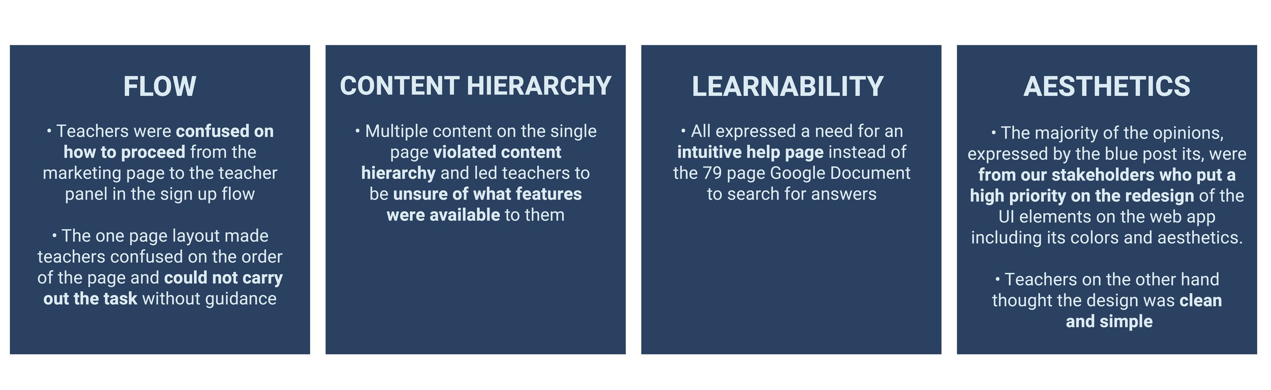
Synthesis

Affinity Mapping
We created an affinity map to better align the goals of our stakeholders with the pain points of our users.
The three major takeaways from our affinity map were: flow, content hierarchy, and learnability for teachers to learn the web app intuitively.
Persona 01
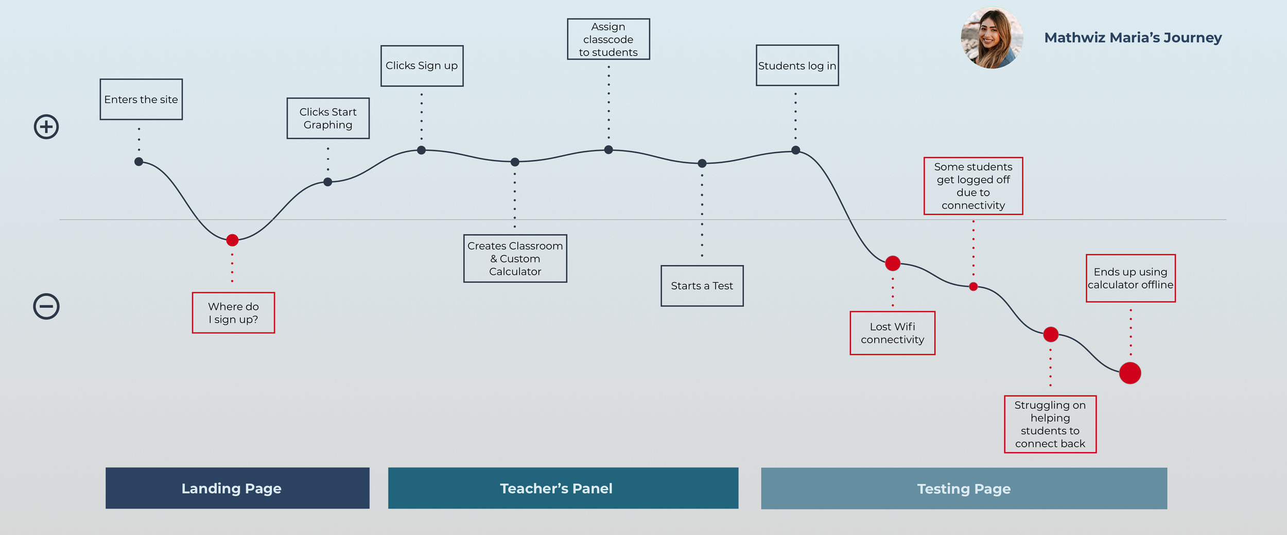
Our first persona is Mathwhiz Maria, who is a 29 year old math teacher in Boyle Heights, Los Angeles teaching Algebra 2 and Pre Calculus.
She wants to provide an equal opportunity learning experience for her students by using ClassCalc and increase student engagement.
Pain Points
• Maria’s school does not provide enough resources for her classes and the internet can be spotty at times, creating a problem with the connection to ClassCalc.
• Not all of her students have access to the latest technology
• She struggles to communicate with her numerous students and keep them engaged during classes
Persona 02
Our second persona is Mathematician Mark who is a 63 year old math teacher at a private high school in Westwood, Los Angeles.
He has taught at the same school for the past 30+ years and struggles to keep current with all the available technology in his classroom.
Pain Points
• Mark struggles to integrate technology into his classroom despite having all the resources available to him
• He gets easily frustrated when technical issues arise
• He relies on the help and tutorial to get him situated with the new technology
Redefined Problem Statement
We learned that issues with the UI were independent of the lack of flow, content hierarchy, and learnability for the users. How might we redesign the teacher panel and dashboard to improve usability for current and future users?
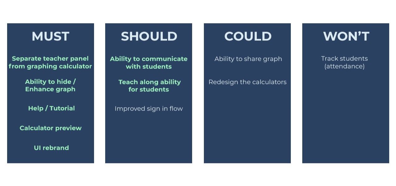


Feature Prioritization
Our feature prioritization was broken down into Must, Should, Could, and Won’t by referencing the MCSW chart. All features highlighted in teal were incorporated into our final design.
We put “improve sign-in flow” in the should since all users struggled to sign into the web app, but since it was out of our scope, we did not include it in our design.

Design


Design Studio
We started by holding a design studio where we individually created and shared with one another our ideas before collaborating on one version we thought to be the solution; thus creating our paper prototype.
Paper Prototype
We conducted an A/B test with 6 teachers to determine which paper prototype worked best for them. We compared the existing flow with all elements on one page versus our ideated version which separated the teacher panel and the graph.
Pain Points
• All 6 teachers liked elements from both versions of the A/B test.
• The pop out icon was helpful but not intuitive for teachers, many in fact skipped over this feature entirely.
• The iconography and terminology on our simplified global nav were unclear and left teachers confused.

Redoing The Paper Prototype
After the results from the first round of usability testings, we went back and held another design studio, where we created a new paper prototype combining both the proposed and current web app layout from our previous paper prototype, then tested with 4 more teachers.

Pain Points
• All users thought the simpler, streamlined process was more intuitive and appreciated the separated teacher panel and graph for clarity.
• They mentioned that they would want a separate page for account settings to change their personal information for security purposes rather than changing it on a dropdown
• They wanted to know the basic functionalities of the web app prior to starting the test.
MIDFI Prototype
We took our findings from the paper prototypes and created a digital midfi to test with teachers. At this point we checked in with our client where we shared our midfi, and he informed the team that there was more than one calculator available for teachers to use on the webapp.
We solved this problem by creating a dropdown menu separating each calculator page from graphing to scientific to the matrix calculator with room for growth as he asked. We then tested with 9 teachers the newly improved MidFi prototype.
Insights

• The location of the timer on the test panel seemed like a button to users and did not inform them of its purpose
• Wording on the modals and pop-ups were not concise and directive in leading users to the task
• Iconography such as the home button on our graph page confused users about its functionality
Moodboard
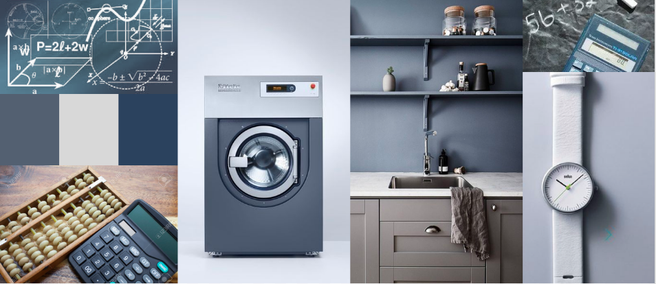
We aimed for a clean, minimalistic design with unobtrusive colors and patterns. We chose blue and grey for the simplistic clean palette while relying on its color psychology of calmness, stability, and reliability to create a straightforward design.
The ordered stacks of the abacus shaped the grid-like structure of our design while the sharp clean minimalistic lines of the washing machine and graph lines influenced the clean academic aesthetic we strived for.

Final Prototype
HIFI Prototype
With the insights from our MidFi usability tests, we took our mood board and designed our HiFi prototype, which we then tested with 10 teachers, 1 developer, and 1 current existing user.
Pain Points
• The copy elements were too small and difficult to read on the modals especially for teachers like our persona Mathematician Mark, so we took into account the accessibility of the site by making it more legible.
• The visibility of the start button on the teacher panel was too low and hard to notice, so we made it more dynamic and placed it higher on the page in our final prototype
• Our student calculator was not intuitively understood for the teachers which led us to create another modal when arriving at the student page to inform users of the functionality of the site.
Next Steps
We want to expand the capabilities and functions of the web app to include the teacher's graph to be displayed on the student app for instructional purposes
We want to work with developers to oversee the feasibility of the design with its locking and graphing functions.
We propose redesigning the marketing home page to allow for a better and smoother sign-in flow for teachers.